Follow the link to view the entire repository on Github: https://github.com/gabbycjames/DataScienceGuidedCapstone/tree/daa6ed798829245316649c236f30880e8394c569/Notebooks
plt.title(label='Average Ticket Price per State')
sns.barplot(data=ski_data, x="state", y="AdultWeekend", width=1, errorbar=None)
#sns.set(rc={'figure.figsize':(5,5)})
plt.xticks(rotation=90, fontsize=8)
plt.figure(figsize=(15,10))
plt.show()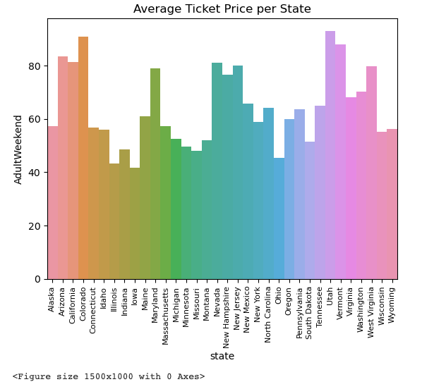
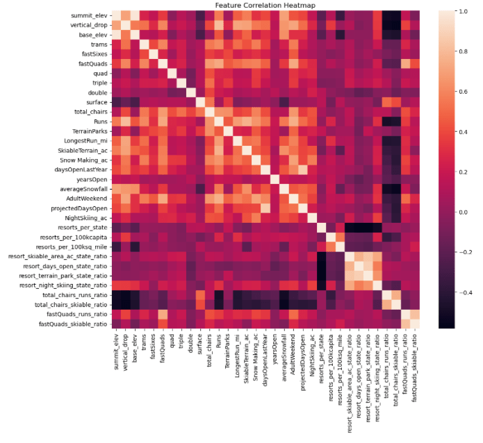
plt.subplots(figsize=(12,10))
plt.title(label='Feature Correlation Heatmap')
sns.heatmap(ski_data.corr(numeric_only=True));